F4f dashboard: interview with Dr. Klervie Toczé
 Can you briefly introduce your role in the FEED4FOOD project and your involvement in the development of the dashboard?
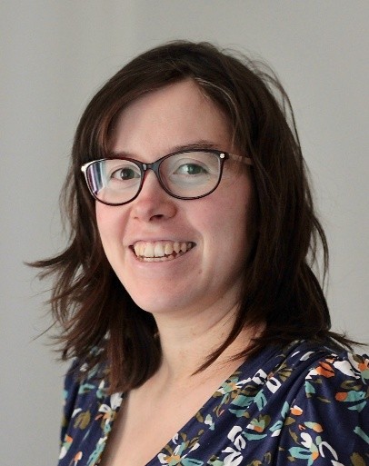
I am Dr. Klervie Toczé, a postdoctoral researcher at the Vrije Universiteit Amsterdam (my official job title is Research Associate). My role in the FEED4FOOD project is to design and implement the FEED4FOOD dashboard, which I now call a knowledge hub because it includes more than a dashboarding tool. I am the main responsible for the content and the look of this tool, which is developed in close collaboration with the partners, so a large part of my work is to determine what is needed to support the partners and the project goals and how should this concretely look like.
How would you explain the FEED4FOOD dashboard in simple terms to someone who is not familiar with the project?
The FEED4FOOD dashboard is basically a website which has several functionalities. There is a part dedicated for gathering data, where users can fill in (and edit/delete) forms with information such as how much vegetables were produced or how much water was used to irrigate. The second part is the actual dashboard part where different visualizations show the collected data as well as the result of analyzing such data. For example, the amount of vegetables produced can be used to determine a nutrition profile of the production.
Screenshot for the data gathering part:

Screenshot for the data visualization part:

How does the dashboard support the goal of improving food security and access to healthy, balanced food in the communities involved?
The dashboard supports this goal by enabling the collection of data and visualization of the current progress towards key indicators related to this goal. For example, a user only needs to enter the data about the production, and the dashboard will show the number of calories and different vitamins this corresponds to, which makes it easier to see how the balance in the food can be improved.
How does the dashboard translate data into useful insights for local communities and practitioners?
The main tool we use to translate data into useful insights (as well as to make sure we collect relevant data) is the Key Performance Indicator framework developed by Fatima et al. [1]. This framework is used to connect the data measured to the goals that should be achieved. This way, the partners could define what they would need insights about (the goal part) and we worked together to see what data would then be needed to be measured. This work resulted in 6 Key Performance Indicators (KPIs) common for the three different Living Labs. Those can be visualized in the dashboard, as well as data for each individual garden/farm which is part of a Living Lab.
Can you give an example of how a community, a municipality, or a Living Lab manager could use the dashboard in practice?
The dashboard can be used to e.g. track the financial situation of the garden/farm or to identify gaps in the nutrition profile of the production.
How did you ensure that the dashboard remains accessible and relevant also for non-technical users?
This is done through several design decisions: first, the data is entered using forms which most users, even non-technical ones, should have prior experience with. Then, there are different user types so that part of the more complex tasks is only performed by a few dedicated users in the Living Labs, who can get the extra training if necessary. There will also be dedicated training material developed and a specific usability study will be conducted to identify potential issues with the interaction with the dashboard tool.
How does the dashboard support the work and evolution of the Living Labs across different cities?
I am not sure I understand what you mean with “evolution” here. The dashboard supports the work in the project at different levels, this is in particular visible in the visualization part where you have visualizations focusing on the garden/farm level, then other visualizations of the KPIs at the Living Lab level. Finally, there is a plan to create a third visualization level to compare the progress of the different Living Labs between each other and enable learning from the other Living Labs.
Do you see the dashboard as a tool that could be replicated or used in other cities or projects? If yes, how?
The dashboard can definitely be replicated or used in other cities or projects. The source code of the project is already publicly available (note that it is still a development version at the moment though which is not yet fully functional, the official release will happen later in the project) and it will be possible to use it to set up the same website which can then be customized with other cities with very little changes. It is also possible to implement different forms or visualizations with a bit more programming experience. It is part of the project to also include documentation about how to customize, modify or extend the dashboard tool for further/other uses.
How can the insights generated by the dashboard support decision-making for local authorities or policymakers?
Local authorities and policymakers can also look at or develop Key Performance Indicators targeting the goals that they have an interest in. For example, about the inclusion of vulnerable communities or how getting trained in a Living Lab can help finding employment. The KPI framework is suitable for all types of goals and can be based both on data collected in the Living Labs or elsewhere (or a combination of both).
What do you see as the main added value of the dashboard for the future of sustainable urban food systems?
The way the content of the dashboard is designed enables the data collection to be targeted. When using the KPI framework, it is clear why the data needs to be collected and where it will be used. As data collection is a demanding process, it adds a lot of value to be able to clearly show a visualization (or several) which directly connects to the data that we ask users to collect. This hopefully will ease the data collection in the long run, and if the data collected is adequate and comprehensive, more impactful analysis can be performed to improve the functioning and sustainability of urban food systems.
What motivates you most about working on this tool and its potential impact?
I really appreciate to work on developing a tool which has a concrete and clear purpose and a meaningful goal. Moreover, I really love the co-design process with the users and it is really motivating to see that I can develop something that contributes to supporting the users in their daily activities, translating their needs into technical solutions. In particular, this is very rewarding when I suggest something and realize that the users were not aware that this possibility existed.
References:
[1] I. Fatima, M. Funke and P. Lago, “Providing Guidance to Software Practitioners: A Framework for Creating Key Performance Indicators,” in IEEE Software, vol. 42, no. 4, pp. 68-78, July-Aug. 2025, doi: 10.1109/MS.2024.3456446. (Link)